


Most founders think they are buying a logo. They are not. They are buying the system that makes every future touchpoint recognizable without anyone having to think about it. A logo is one asset. A brand identity is the set of rules that lets a website, a pitch deck, an ad, a product screen, and a recruitment post all feel like they came from the same company. Get the logo and skip the system, and you spend the next two years improvising, off-brand, one file at a time. This is the framework for building the system, what makes it stick, when to rebrand, and how to choose someone to build it.
Brand identity is not your logo
Three words get used interchangeably, and the confusion is expensive. The brand is the perception people hold of you. The brand identity is the visible system you control to shape that perception. The logo is a single element inside it. You can change a logo in an afternoon. You cannot change a brand by lunchtime.
Why the system matters more than any single asset comes down to one thing: consistency. According to the State of Brand Consistency report by Marq (formerly Lucidpress), presenting a brand consistently across all touchpoints can increase revenue by up to 33%, while 81% of companies still struggle with off-brand content (verified 15 June 2026). The revenue does not come from a better logo. It comes from never making the customer wonder whether they are still dealing with the same company.
There is hard money behind good design more broadly. According to McKinsey’s Business Value of Design study, the top quartile of design performers grew revenue 32 percentage points faster and shareholder returns 56 points faster than industry peers over five years, across 300 companies in three industries (verified 15 June 2026). Design is not decoration. It is a measurable lever, and the identity system is where that lever sits.
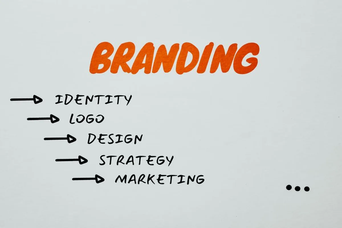
The framework: the elements of a brand identity system
A complete brand identity is built from a small number of parts that work as a set. Treat them as a system, not a shopping list.
- The logo and its variants. Not one file, but a family: primary, secondary, icon-only, monochrome, sized for a billboard and for a favicon. A logo that only works in one context is half a logo.
- The color palette. Primary, secondary, and functional colors, with exact values and rules for contrast and accessibility. Color carries recognition faster than any other element.
- Typography. A type system, usually a display face and a text face, with a hierarchy for headings, body, and captions. Typography is the voice of the identity when no logo is in sight.
- Iconography and graphic language. The shapes, line weights, and motifs that show up across illustrations, charts, and interfaces. This is what makes a slide recognizable before the logo loads.
- Imagery and photography direction. The rules for how photos and illustrations look: framing, treatment, mood. Two companies can use the same stock library and look nothing alike because of direction.
- Motion and applications. How the identity behaves in movement, and how it lands on real surfaces: web, social, packaging, signage, video. A first impression of a web page forms in about 50 milliseconds according to research by Lindgaard and colleagues published in Behaviour and Information Technology (verified 15 June 2026). Motion and application are where that impression is won.
- The usage rules. The guidelines that hold it all together: spacing, do and do not, tone, file structure. This is the least glamorous element and the one that decides whether the system survives contact with a real team.
Miss the last element and the rest erodes within a year. The guidelines are what let a new hire, an external agency, or a partner stay on brand without a phone call.
What makes an identity memorable
Memorability is not the same as beauty. A striking logo that changes on every channel is forgotten faster than a plain one used consistently for three years. The identity that sticks is the one a customer sees often enough, and similarly enough, that it becomes a shortcut in their memory.
That is the practical case for the system over the asset. Recognition compounds. Each consistent exposure reinforces the last. Inconsistency resets the counter. The companies that win attention are rarely the ones with the most original mark, they are the ones that showed up the same way, everywhere, long enough to be remembered.
Between what we sell and what’s true. A new identity will not fix a weak product or a confused positioning. If your problem is that nobody understands what you sell, a rebrand buys you a prettier version of the same confusion. We will say so before quoting the work.
When to rebrand, and when not to
Rebranding is expensive and disruptive, so the threshold should be high. There are good reasons and vanity reasons, and they are easy to mix up.
Rebrand when the company has genuinely changed: a new market, a merger, a pivot, an audience that no longer recognizes itself in the old identity. Rebrand when the identity actively works against you: illegible on mobile, impossible to apply consistently, dated in a way that costs trust. Refresh, not rebrand, when the bones are sound and only the execution has aged.
Do not rebrand because a new executive wants to leave a mark, or because the logo feels tired to the people who see it forty times a day. Your customers see it far less often than you do, and the recognition you would throw away took years to build.
How to choose a brand identity partner
The portfolios all look good. The difference is in the method underneath.
Ask how they arrive at the system, not just the logo. A partner who jumps to visuals before understanding your positioning, your audience, and your business objective is decorating, not designing. Ask to see their guidelines work, not just their hero shots, because the guidelines are what you will actually live with. Ask how the identity will apply across every surface you use, including the unglamorous ones. And if you operate in more than one language or market, confirm they can build a system that holds up natively in each, not a French or English identity bolted onto other markets.
The brief before the brief. A good identity brief does not say “make us look modern.” It says what the brand must achieve, for whom, and against whom. If a studio takes your order without challenging that brief, it will execute your assumptions instead of pressure-testing them. That is the difference between a vendor and a partner.
How the work runs
A brand identity project moves through three stages, the same shape as any serious creative work. Framing: the audit, the positioning, the objective, the brief signed and scoped. Production: the system designed, applied to real surfaces, and stress-tested. Handover: the guidelines, the files, and the rules that let your team carry it forward without us in the room. The deliverable is the file set. The result is a company that stays recognizable for years. A deliverable is not a result.
FAQ: brand identity design
What is brand identity design? It is the design of the visible system a company uses to shape how it is perceived: logo and variants, color, typography, iconography, imagery direction, motion, and usage rules. The logo is one element inside it, not the whole thing.
What is the difference between a brand and a brand identity? The brand is the perception people hold of you. The brand identity is the system you control to influence that perception. You design the identity; you earn the brand.
How is brand identity different from a logo? A logo is a single asset. A brand identity is the full set of elements and rules that make every touchpoint recognizable. A logo without a system leads to off-brand improvisation.
How much does a brand identity cost? It depends on scope: the number of elements, the range of applications, the number of markets and languages, and the depth of strategy upstream. A founder’s starter identity and a multi-market corporate system are different orders of magnitude. Be wary of a fixed catalogue price disconnected from your objective.
When should a company rebrand? When the company has genuinely changed (new market, merger, pivot) or when the identity actively works against you (illegible, inconsistent, dated enough to cost trust). Not because the team is bored of the logo.
Does brand consistency really affect revenue? The evidence points that way. According to Marq’s State of Brand Consistency report, consistent presentation can lift revenue by up to 33% (verified 15 June 2026). The mechanism is recognition compounding over time, which inconsistency resets.
Before you start
A brand identity is not a logo you commission and forget. It is a system you build once and apply for years, and its value comes from discipline, not novelty. Decide what the brand must achieve and for whom before you look at a single visual. The colors, the type, and the mark follow from that, never the reverse.
To start, we audit where your identity stands today and frame what it needs to achieve, then tell you plainly whether you need a full identity, a refresh, or just a tighter set of rules.